Photography's Histories in Omeka (2015-2017)
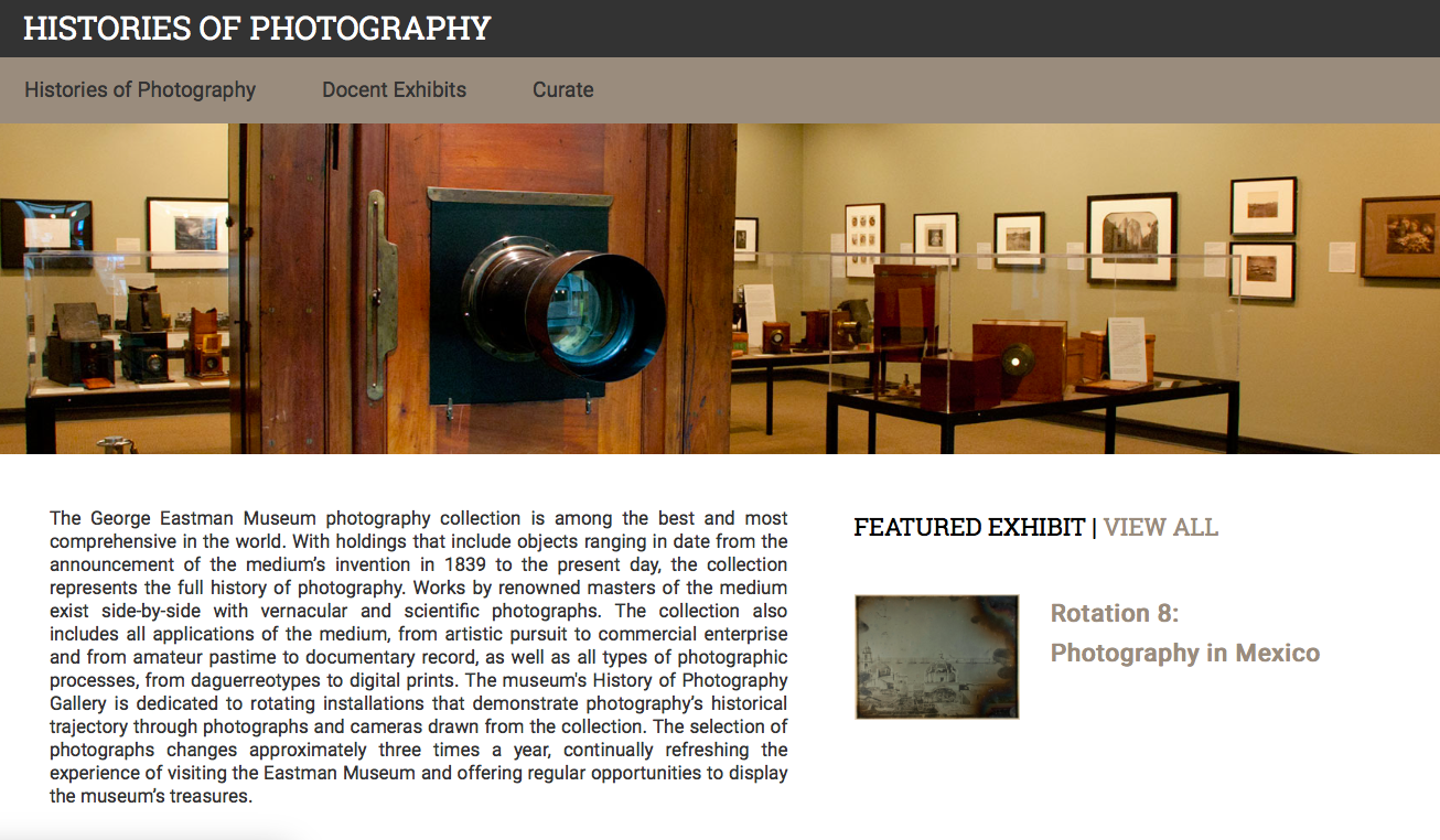
From 2017 to 2019, I volunteered as a docent for the History of Photography galleries at the George Eastman Museum in Rochester, NY. The exhibiton changed every few months, and for each I would receive a PDFs with small images and wall text for each object.
In preparing for my tours, however, I wanted a way to view images more in-depth that would more closely approximate the opportunities afforded in the gallery itself. I took this opportunity to explore Omeka as a possible platform for organizing object metadata and recording my evolving thoughts on each work, especially as they were shaped by interactions with museum visitors.
Technology
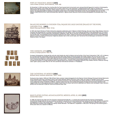
This project originated as a test case for Omeka wherein I could explore the platform’s possibilities. Working with the Eastman Museum’s collection allowed me to skip right to questions about user experience, since the difficult labor of gathering metadata and creating high-quality images was already done. That being said, I quickly found that Omeka did not work quite how I imagined it to, particularly with regard to the popular Exhibit Builder plug-in. I wanted each image to be accompanied by art-historical “tombstone” information—photograph title, photographer, date—into the display. To accomplish this, I made adjustments to the PHP code in the base Exhibit theme files so that this metadata would be automatically displayed for each item.
Scale
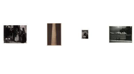
Expanding out from this original function, I next began to explore ways that a web interface could enhance visitors’ understandings of the exhibitions, especially once their physical instantiations were replaced. After all, the purpose of these museum exhibitions is not simply to show off images, but to show off objects, made with different photographic processes, cameras, and materials. From this perspective, a grid or even list of equal-size thumbnails works against the idea behind the exhibitions, which is to enrich the narrative of photography’s history with an understanding of its many technological transformations. For example, the large size of certain USGS survey photographs points to practice of contact-printing glass plate negatives, while the ability to print large images in the late 20th century signals the improvement of digital printing. In the gallery, these insights are important aspects of the history as it is imparted to viewers, but the standardized scale of the typical online archive reduces if not entirely obliterates their visual impact.
Therefore, as I developed the project, I began exploring alternative modes of presentation. The current solution is rather simple: a horizontally-scrolling window in which photographs are displayed to scale. The sideways scroll and center orientation abstractly mimics the layout of the exhibition space, while the addition of a lightbox points to the experience of stepping close to a photograph and switching from exhibition view to the single object and ultimately its finest details. As a result of this project, scale has become an incredibly important element of my interest in digital technology’s potential for displaying photographic collections. Displaying objects in an exhibition at a comparative standardized scale is a fairly simple premise that nonetheless has a significant impact on how viewers understand the objects they are viewing, and I became interested in pursuing this issue in future work.


