Slowly Looking at Uncommon Places (2015-2017)
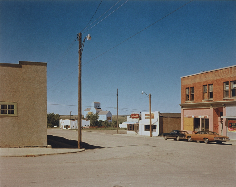
In 1971, the photographer Stephen Shore made a series of ten postcards of landmarks in Amarillo, Texas. Some locales were expected yet anonymous, like the geometrically structured Civic Counter. Others, like the Double Dip ice cream parlor at 1323 South Polk, were more idiosyncratic. When Shore had the series in an edition of 5,600, he omitted some important information: the location of these landmarks in Amarillo. Thus anonymized, the postcards could have been sent from Anytown, USA. Indeed, they probably were: on a 1973 cross-country road trip, during which he began his series Uncommon Places (1973—1982), he brought the postcards along and surreptitiously slipped them into the card racks of local stores. Thus disguised among other images of similarly generic architecture and consistently blue skies, these images of Amarillo insinuated themselves into the tourist imaginaries of small towns across the country.
Time and Space
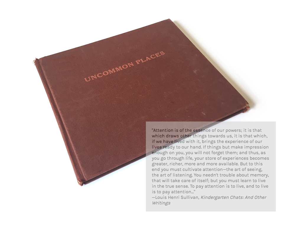
Inspired by postcards, this project takes Shore’s Uncommon Places as an opportunity to explore how photographs—like these postcards—move, circulate, and affect our vision of place. His original 1982 publication of the series included 49 photographs made over many years and many trips. Rather than mapping the book’s impractically—even impossibly—peripatetic route, the first part of this project will map the distribution of each photograph’s place to new sites of residence. In addition, when possible, the maps will include sites of each photograph’s exhibition, demonstrating the distribution within Shore’s selection of images, already themselves then from a much larger group, as representatives of his work. Drawing on the geometric quality of Shore’s large-format compositions, this project asks how photography’s reproducibility and the existence of many distinct prints of the same negative disrupt normative expectations of geographical space.
Pictures & Prints
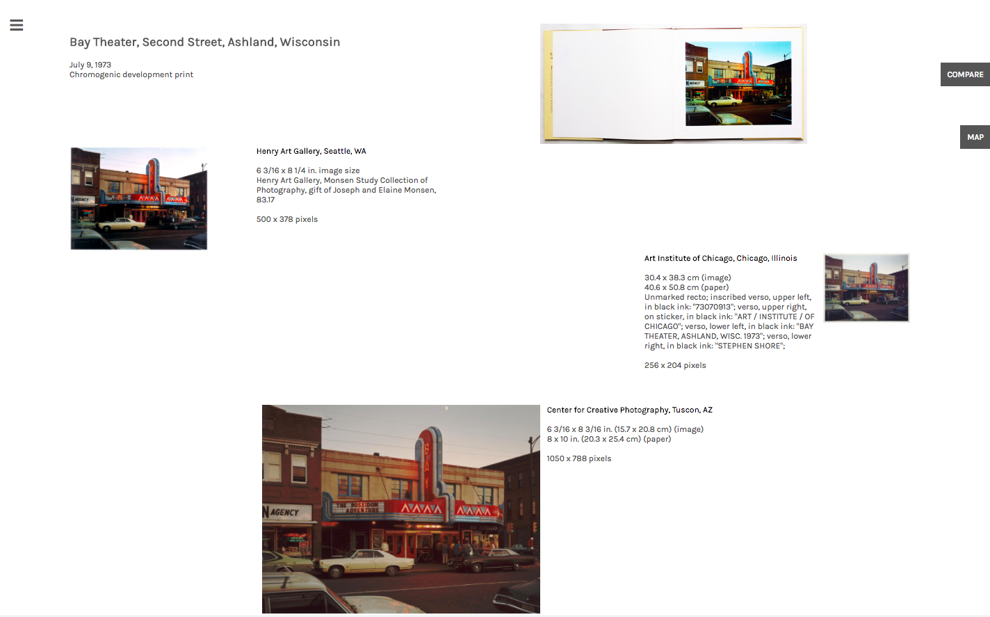
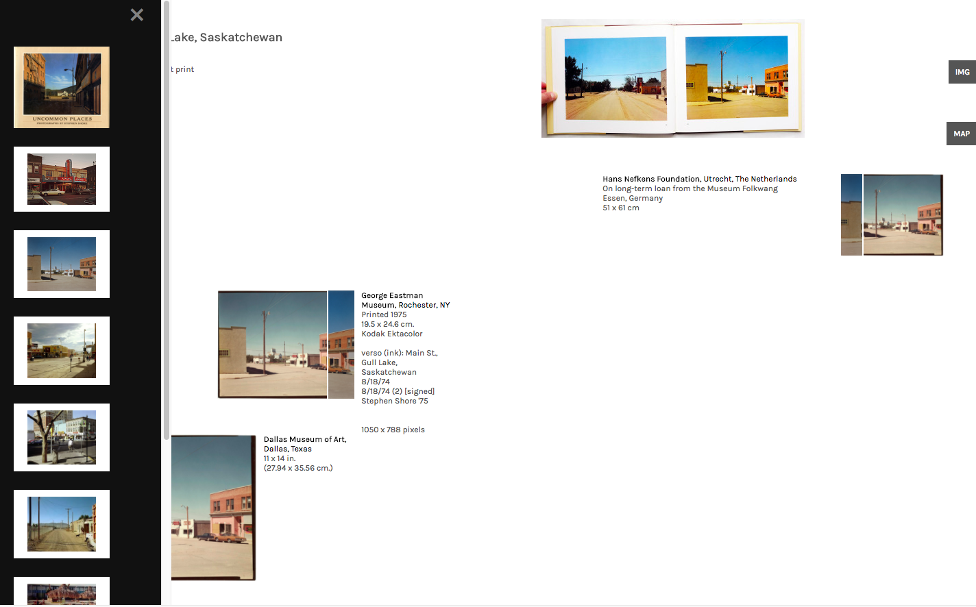
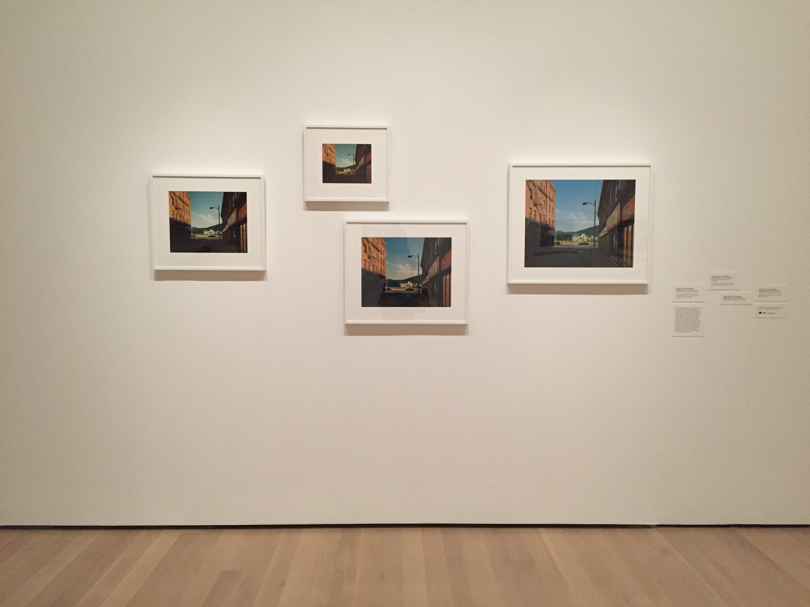
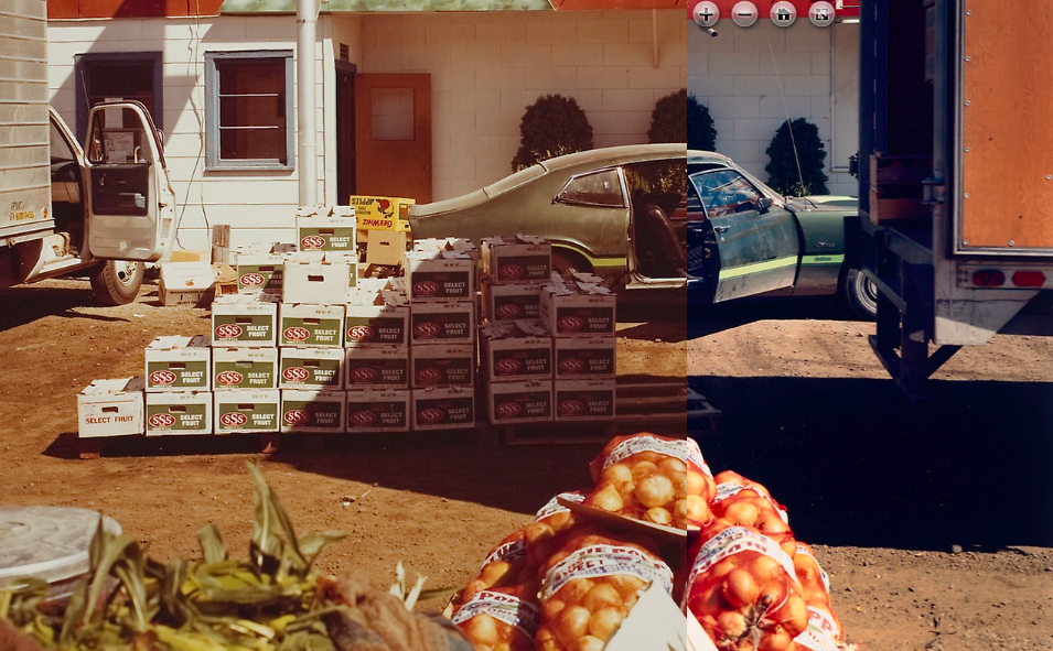
The second part of the project takes the geographical distance between photographs of the same place as a jumping off point for thinking about photography’s mutability. While multiple institutions may own the same photograph, they may vary in printed size and condition, to name some examples. The instability of 1970s chromogenic dyes also makes for pronounced variations in color due to fading over time. Digitized versions of these photographs available on museum websites make these variations at once more apparent and more opaque. Differences in digital image size, color modes, and scanning technologies accentuate the phenomenon of variation while adding their own versions, muddying the ability to know much at all about the physical print despite the claims of digital archives to tell us just that.
The user is given the opportunity to explore these issues through an interactive interface where images can be toggled between what we might think of “thumbnail” and “full size” images, generically put, as well as between prints. That some images can be enlarged much more than others—due to differences in scanned resolution–points again to the opaque inconsistencies marring the assumed transparency of the digital archive. Where possible, I hope to include as such metadata as possible about the photo objects as well as the digital images.
Technology
This project combines HTML/CSS, Neatline (based in an Omeka platform), and a collage of Javascript implemented with the use of tutorials.
Scripts include:
Project Update: 2017
At Shore’s 2017 retrospective at MoMA, I was pleased to find this display of photographs that gives aesthetic support to my independently-derived interface.
Project Update: 2019
When I started this project in 2015, I sought out ways to manipulate images: to resize them on click, to compare two images, and to embed high-resolution viewing. In 2019, the Image Interoperability Framework (IIIF) is making these tasks easier every day. In future work, I hope to develop a second version of this project based on two Shore prints in the collection of the Art Institute of Chicago.
